Project Overview
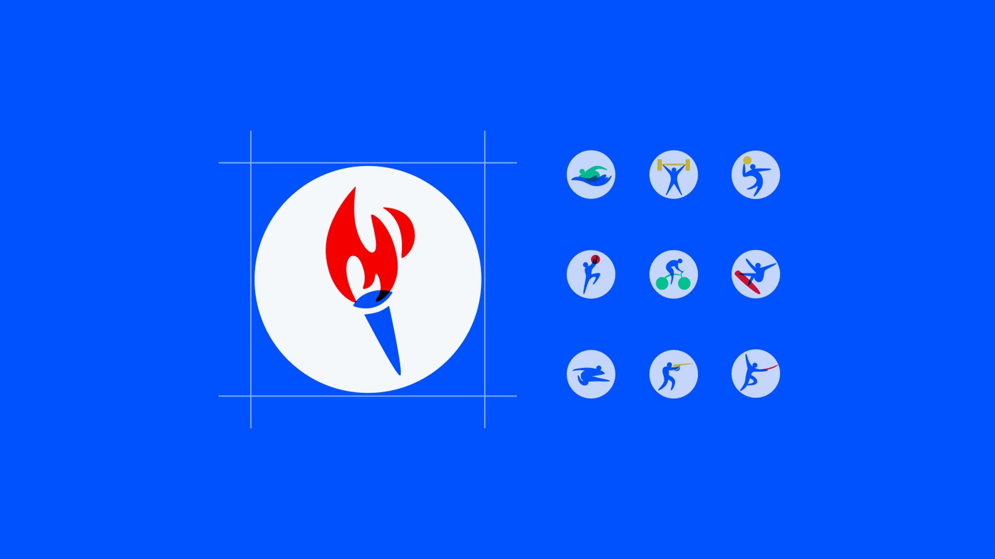
If you’ve used any Yahoo apps or sites (e.g. search.yahoo.com and sports.yahoo.com) during the 2021 Tokyo Summer Olympics and 2022 Beijing Winter Olympics events, you may have noticed that we did not just use the official Tokyo Pictograms.
Yep, we decided to create our own version of the pictograms to better fit the brands and vibe of our own products. I’m so psyched about having the opportunity to drive this effort by collaborating with the Yahoo Sports team, et. al.
The Problem
Prior Arts
I did not start from scratch though. Moe Haidar, one of our illustrators, had explored with illustrating the six major sport categories (i.e. Archery, cycling, weightlifting, athletics, rowing, and swimming):


His work renders very well at larger scale and is therefore very suitable to be used as covers. However, this style looks overly glaring and informative to be used as icons, which are often as small as 36px, in the rest of interfaces. And that’s where the team reached out to me (someone known as a hybrid of product design and illustration/visual design) for help.
Analyzation
In a nut shell, some of the design elements that made the original style stunning are also the reason why it looks so busy at smaller scale. The human body is overly detailed to meet the goal as an icon. In another word, we should abstract out some details.

I want to maximize the similarity with the original style to form a consistent design language that form a vibrant vibe to fit in our product interfaces.

So I intentionally wanted to keep:
- The color palette and the multiplication effect
- The bright color system with delicate and airy style.
- The smooth and flow-y human postures.
Color Development
Initial Exploration
I initially took a pass at simplifying Moe's figure to try to limit the color usages to make it less overwhelming and faster to read.


But when I was doing the stress test to put them on mock, I realized that each independent, diverse color still fragment the body quite a bit.

Favoring dual-colors
To optimize the style towards faster readability even more, I decided to further simplify the color palette to only two for each icon and reduce the multiplication effect by eliminating the overlapping of the same color shape and make human body a one solid unit.
In addition, after communicating with legal team, we decided to use the blue colors, which, fit with our brand, as the main human body to be inclusive and ionic

When is 3rd color necessary
Sometimes the equipment are critical to identify the sport, and two colors are just too not enough. A third color can be introduced in this case:

Special-case water sports
It’s well expected that water are blu-sh. Therefore, when water is a necessary component to convey the concept, we will instead let the water take the blue color and use green for human (again, legal audited) and yellow for objects.

Shape Development
The colors now looks decent but the style now looks trivial and missing some dynamic vibe.
Human body
We ended up by fluid shapes and utilizing pointed arm and leg to capture the most extreme poses for each sports.
- Arm and leg: The pointy shapes
- Head circle: 4.5 px or optical compensation to achieve visual balance
- Waist size is approximate with head size

Arc-shaped equipments
To make the icon set more stylish and increase our own identity, I came out a solution to abstract all sport equipments, the key components of every sport, as an unique, consistent arc-shape:

Mass Production
From the above style definition, I’m confident to replicate the icon production for each sports.
I usually start with googling the specific sport and picking a reference images that picture the most memorable pose of that sport:
The process is not all roses either
Sometimes I got stuck in picking a best pose and I often need to take a break to get a fresh pair of eyes to try that again.
It’s also not common that there may be multiple candidate poses and people may disagree with each other on the best pose, so never stop asking for feedback from your peers.
Final Result
It took me a week to explore the style and another 1.5 weeks to work on each icon's pose and unify 30 of them in a family.
As I'm figuring these things out and putting it all together, I'm leaning on other groups of designers and researchers for input and validation.
This icon set was launched on search.yahoo.com and sports.yahoo.com during the 2021 Tokyo Olympics. A big shout-out to Ben Chu and Mika Jiang for providing constructive feedback and great ideas to bring the icon set to go live!


